Brunngård
Elevating the premium segment of Springyard’s shoe care segment.
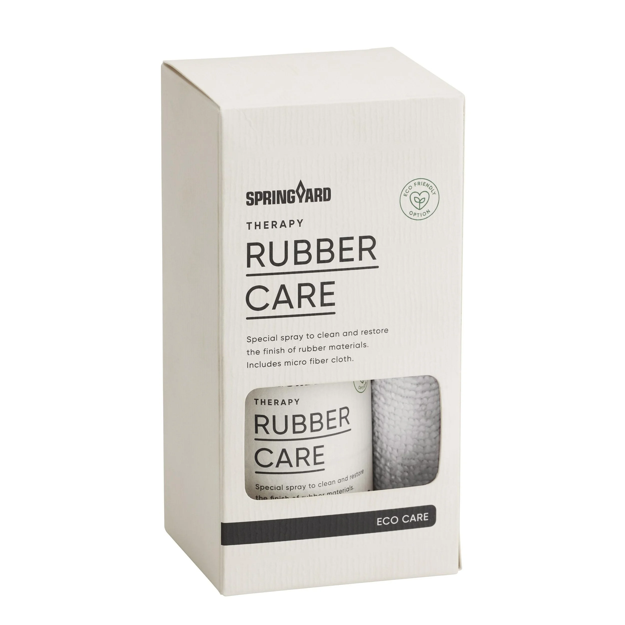
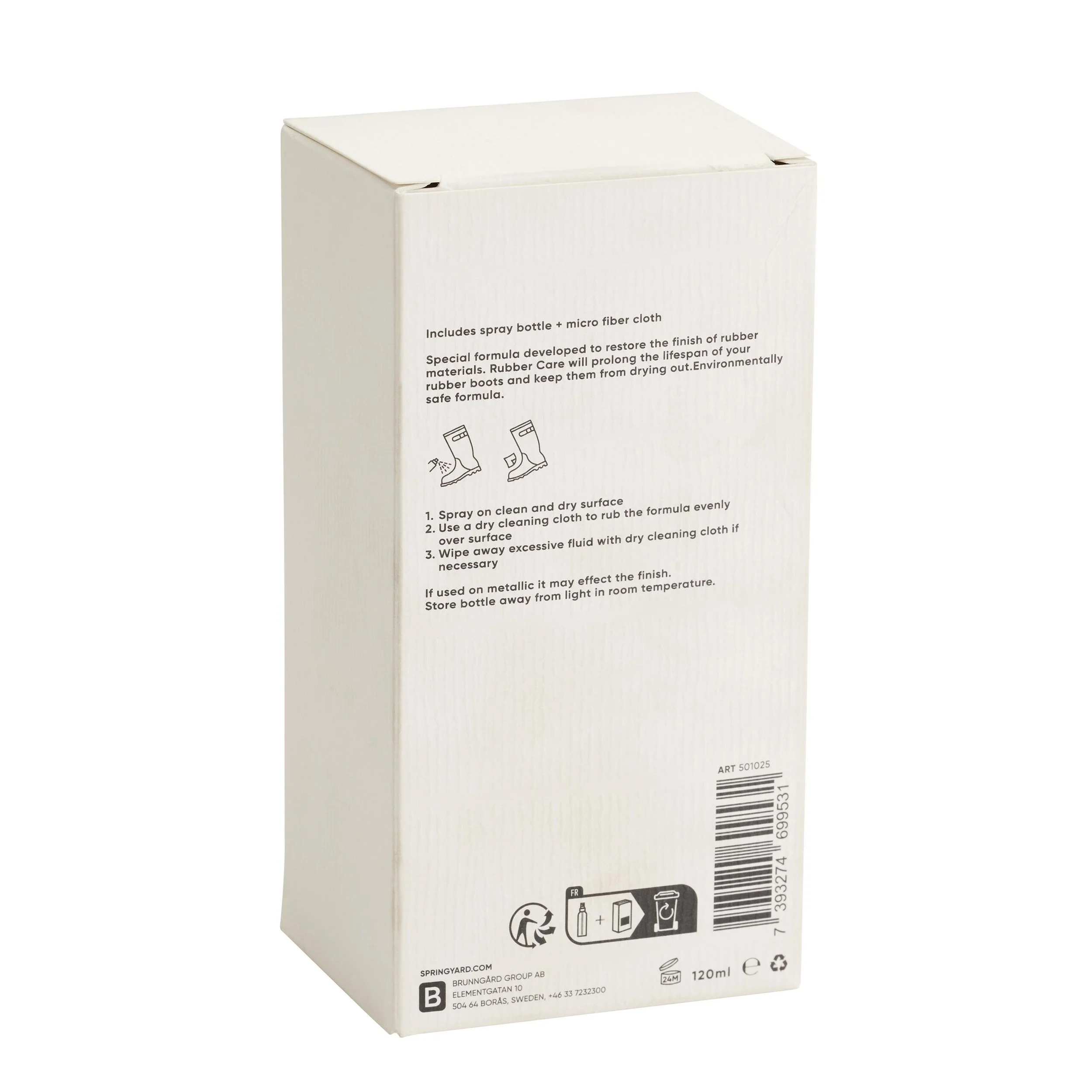
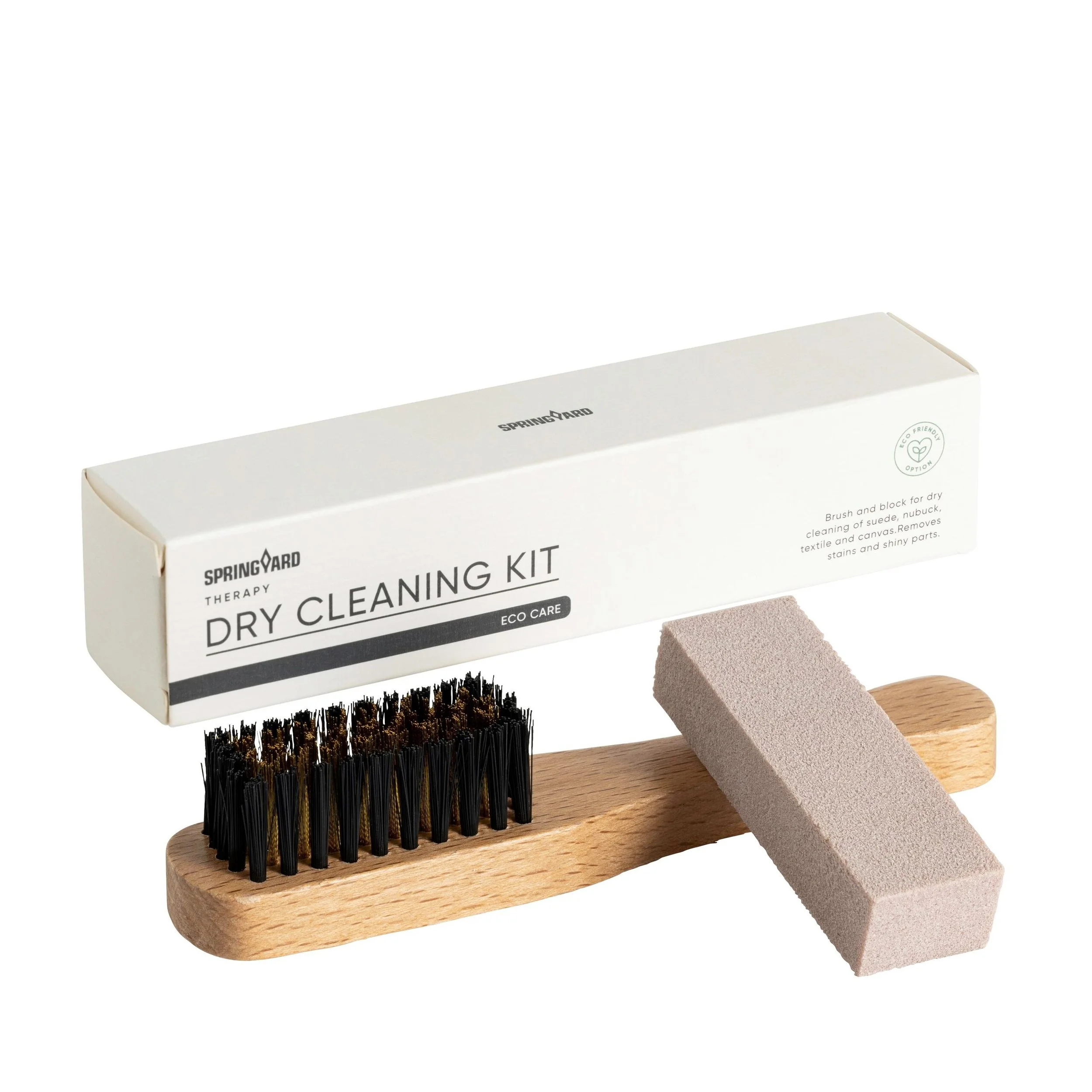
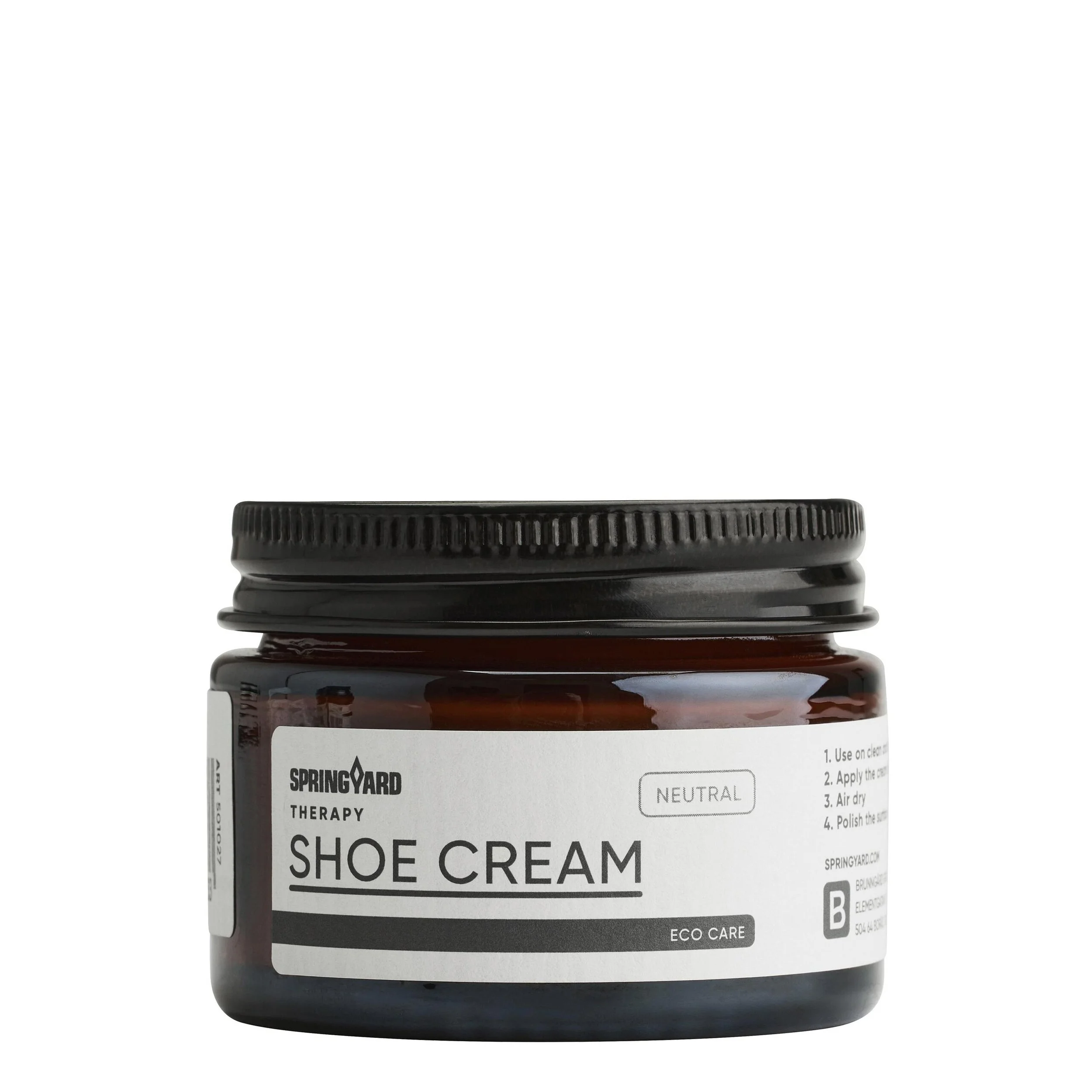
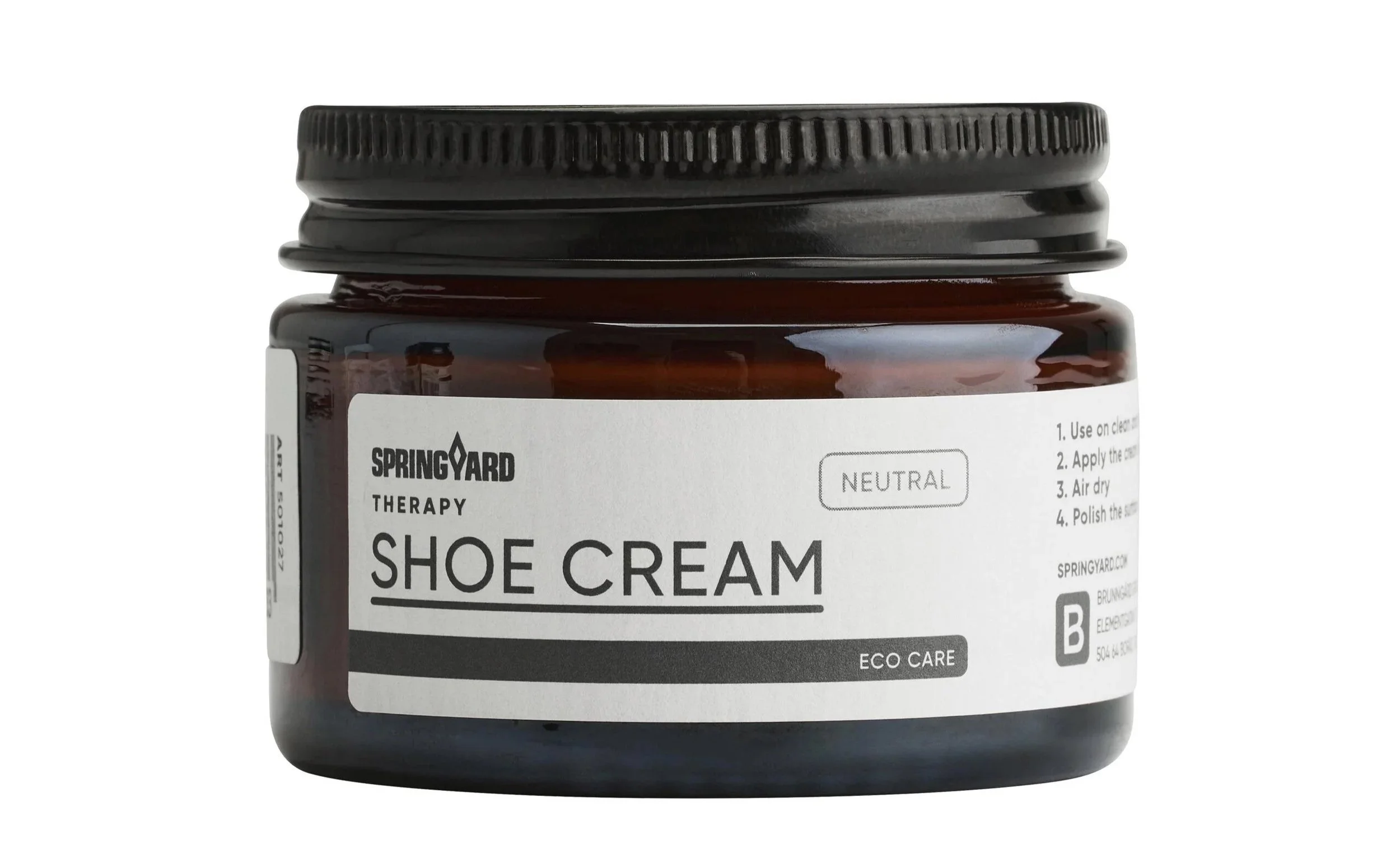
We started with a product/function/sub-brand matrix to define each container. With a wide variety of products and segmented distribution this matrix became the frame work for each design. A framework to ensure a specific tonality needed to communicate effortlessly with the target group and distribution in question. Here is a selection of the design language we landed in for Brunngård’s brand Springyard and it’s sub-brand Therapy .


Readability
The tonality of this particular segment could be framed as; such an interest in taking care of your shoes that the expression Therapy feels relevant. A certain calm and clarity with the knowing that this is good for booth you and your shoes.
Still within this tonality there is a crowded space with sometimes limited lighting where these products meets the end user.
First point of attention - Make the name clear, short and self explanatory.
Second point of attention - Use typography and layout that radiate the main tonality while being very easy to read.
Trustworthy
Would a short glance of these products be enough to instill a feeling of trust? This segment of products are carefully made to be suited for fine and delicate leather and suede shoes. Shoes that can cost a lot of money. The overall feeling of the product should be - “I can trust this with my finest shoes.”